
The Shortest Logo History in Italian Motorcycling
Italian motorcycle badges tend to be busy. Moto Guzzi has its eagle. Benelli has a lion standing on a crowned silver medallion. Ducati has cycled through roughly ten distinct marks in a century — a lightning bolt, a fascist-era monogram, a winged eagle, an elephant, a stylised D that everybody mistook for a coffee bean, and finally the red shield. MV Agusta, Laverda, Bimota: wreaths, wings, shields, heraldry.
Aprilia has a word in a red box.
That is not a failure of nerve. It is the endpoint of a deliberate eighty-year narrowing, and it explains why the badge does something almost no other motorcycle logo manages: it works at 220 mph, three metres tall, wrapped around the flank of a MotoGP fairing, and it still works at eight millimetres wide on a key fob.
Aprilia has changed its logo four times since 1945. Ducati managed ten in a comparable span. And each of Aprilia's four changes lines up precisely with the company becoming something it had not been before — a bicycle shop becoming a moped maker, a moped maker becoming a motorcycle manufacturer, a motorcycle manufacturer becoming a racing team, and a racing team becoming a global brand.
A note on sources before we start. Aprilia has never published an official brand chronology, and the Piaggio press archive does not include one. The date ranges below are reconstructed from logo archives, from what appears on period machines and sales literature, and — where possible — from trademark filings. Where the record is genuinely uncertain, this article says so rather than inventing a tidy answer. Several of the pages that rank for this topic contradict each other and the physical evidence; a few appear to be machine-generated. Treat any confidently precise date you read elsewhere with suspicion, including the ones here.
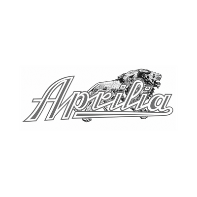
1945 - c.1970 The Leopard and the Script
Aprilia begins in 1945, in Noale, a small town in the Veneto about twenty kilometres inland from Venice, where Cavaliere Alberto Beggio opened a workshop building bicycles. For roughly the next twenty-three years, that is all Aprilia was: an artisan bicycle maker in a country full of artisan bicycle makers.
The badge from that period tells you exactly that.
It is a flowing cursive script — "Aprilia" with a capital A, rendered as an outlined, chrome-effect italic built from several offset contours, with a long swash sweeping beneath the whole word. Prowling across the top, its forepaws breaking over the lettering, is a snarling spotted big cat — a leopard, drawn in fine engraved crosshatch, with a heavy neck ruff and open jaws. Monochrome throughout. No red anywhere.
Three things are worth pulling out of that.
First, it is a transfer, not a logo. Postwar Italian and British bicycle badges were water-slide decals and pressed head-tube plates, made by the same trade that decorated fairground rides and shop fascias: heavy outlining for legibility against paint, a chrome effect built from two or three offset contours, and as much flourish as the surface would carry. This is a textbook example. It was never meant to be reduced, reversed, or reproduced in a single colour on a letterhead. It was meant to look expensive on a head tube.
Second, the animal is doing the work a wordmark could not. Putting a fast predator on a bicycle badge was near-universal practice — Bianchi's eagle, Panther, Jaguar, half the British trade. A big cat sold speed to a customer who could not test-ride the difference between one steel frame and another. It is the same instinct that gave Moto Guzzi an eagle and Ducati a pair of wings, and Aprilia would eventually be the Italian marque that refused it hardest.
Third, look at the dots over the i's. They are small squares, set inside outlined boxes. Aprilia's modern wordmark is distinguished from every generic grotesque by exactly one detail — square tittles instead of round ones — and it turns out the motif was there on the bicycle badge, three logos and forty years earlier. That is almost certainly coincidence rather than continuity. It is a good coincidence.
Nobody can tell you exactly when this badge stopped. The archives date it to "1945–197?" — deliberately open-ended. Small Italian manufacturers of the period routinely ran two or three badge variants at once across different products, and this one faded rather than being replaced on a particular Tuesday.
1970 - 1974 Red Ink, and a Word That Reads at Speed
In 1968, Alberto's 24-year-old son Ivano Beggio took over the business, ended bicycle production, and built Aprilia's first powered vehicle: a 50cc two-stroke moped finished in gold and blue. The Colibrì and Daniela mopeds followed. In 1970 came the Scarabeo, Aprilia's first true motorcycle — a 50cc off-road machine, with a 125 arriving at the 1971 Milan Show.
The badge changed to match, and the change was drastic.
Out went the leopard, the chrome contours and the fine engraving. In came a single unadorned wordmark in solid red — and, importantly, not a script. The letters are separate, not joined. It is a fat-face italic serif in the Bodoni tradition: heavy stroke contrast, a flat-topped A on a bracketed foot, and round ball terminals on the a, the r and both i-dots. Where 1945 imitated a signwriter's brush, 1970 imitates a printer's display type.
That is a bigger break than it looks. A bicycle head badge is examined at arm's length by someone standing still. A moped tank badge is glimpsed at thirty miles an hour by someone in traffic. Everything that made the 1945 mark beautiful — the fine engraving, the tonal contours, the animal — turns to mud at speed and disappears entirely in a black-and-white newspaper advertisement. The 1970 mark solves all of it at once: one weight, one colour, no illustration, letterforms fat enough to survive a bad print run.
And red arrives, permanently. Aprilia has never seriously used another primary brand colour since.
It is also still, notably, a name in fancy dress. Italy in 1970 was full of ornamental display wordmarks — the visual language of family firms who wanted you to know a family was behind the product. That reading of Aprilia had about four years left.
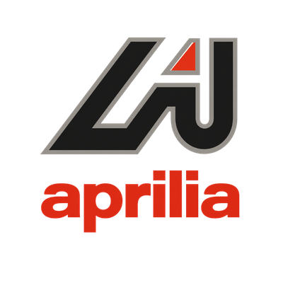
1975 - 1985 The Arrow
This is the most interesting logo Aprilia has ever had, and the only one it ever abandoned completely.
In 1974 Aprilia built its first true motocross bike. In 1975 it formed a dedicated race department, the Reparto Corse. From 1976 to 1981 it contested the 125cc Motocross World Championship, and in 1977 Ivan Alborghetti won both the Italian 125 and 250 motocross titles on Aprilias. Within eighteen months of the new badge appearing, Aprilia had stopped being a company that happened to go racing and become a company organised around it.
The 1975 identity is the only Aprilia badge built for that company, and it has two parts.
On top sits a large angular monogram: flat charcoal shapes with a warm-grey keyline running around the outside. A thick slanted bar descends from upper right to lower left, forming the diagonal of an A; to its right, a tall stem drops and hooks left at the bottom into a J-like curl. Nested in the notch where the two meet is a small red triangle. There is no bevel, no gradient, no chrome — it is a flat mark with an outline, and it is far more modern for it.
Below, in lowercase and in red, sits the wordmark: aprilia, in a heavy geometric grotesque, with square dots over both i's.
That wordmark is the sleeper detail. It is not an ancestor of the modern logo — it is essentially the modern logo, in red, ten years early. Set it beside the badge Aprilia uses today and the letterforms and the square tittles are the same idea. The 1975 design invented the current Aprilia wordmark; it just buried it underneath a symbol.
As for the symbol itself: it is not really a letter. It is an arrow that resolves into an A, and the ambiguity is the point. Angled strokes, a hard apex, a nested triangle pointing the same way — every element pushes in one direction, and nothing about it is decorative. It belongs to a very specific moment in European design, when manufacturers were converting family names into abstract geometric symbols as fast as they could hire people to draw them.
The monogram ran on the side panels of Aprilia machines for a decade, through the RC enduro series and the expansion into trials and road bikes, right up to the arrival of the AF1 — and then it was gone.

1986 - Present The Red Box
In 1986 Aprilia launched the AF1, a 50cc race-replica aimed squarely at teenagers who wanted a miniature Grand Prix machine, followed by the definitive liquid-cooled AF1 125 in 1987. In 1985 Aprilia had begun buying engines from Rotax and had entered the 250cc Grand Prix World Championship with Loris Reggiani. On 30 August 1987 at Misano, Reggiani won — Aprilia's first Grand Prix victory.
The badge adopted at the front of that run is the one Aprilia still uses.
It is the lowercase wordmark from 1975, promoted and left almost exactly alone: aprilia in white, reversed out of a solid red rectangle. The monogram is gone. The keyline is gone. The italic is gone. There is no symbol, no illustration, and no capital letter anywhere in it.
Four decisions carry the whole thing.
Lowercase. No capital means no hierarchy, no formality, and a much more compact block of letters than APRILIA would give you. Capitals in a horizontal word produce a long, thin, awkward shape. Lowercase, with ascenders on the l and the two i's and a descender on the p, produces something closer to a solid rectangle — which is exactly what you want if you intend to sit it inside one.
The fit. The letters are tightly spaced and heavily weighted, and the l-i pairing in the middle very nearly closes up into a single vertical mass. The word reads as one object rather than seven letters. That is what lets it survive being stretched three metres across a MotoGP fairing, where the eye gets about a fifth of a second to catch it.
The square dots. The tittles over both i's are squares, not circles — the only piece of deliberate eccentricity in an otherwise generic grotesque, and the detail that stops the wordmark being mistakable for Helvetica set in red. It is a small thing doing a large amount of work: it makes the letterforms proprietary, and it rhymes with the rectangle around them.
The red field. The rectangle is doing something most logos do not. It is not a container for the logo — it is the logo, and it is also a livery element, a colour block, a page header, a fairing panel. On aprilia.com today the entire site header is the red field with the wordmark sitting in it; on the RS-GP the wordmark runs across the bodywork with no box at all, because the bike is the box. A shield or a roundel has a fixed edge. A rectangle can be any size the surface is.
The Forty-Year Run
What happened after 1986 made the decision look prescient.
Alessandro Gramigni won Aprilia's first world championship in 1992. Max Biaggi took three consecutive 250cc titles from 1994 to 1996. Valentino Rossi rode Aprilias from 1996 to 1999, winning the 125cc title in 1997 and the 250cc in 1999. Kazuto Sakata and Loris Capirossi added more. The RSV Mille arrived in 1998, the RSV4 in 2008, the first World Superbike title with Biaggi in 2010, and the first MotoGP win with Aleix Espargaró in Argentina on 3 April 2022.
Through all of it — through the near-collapse of 2003–2004, through the Piaggio Group acquisition in December 2004, through the whole modern era — the badge did not move. Aprilia spent nearly four decades putting that word on fairings in front of television cameras. A company doing that does not want a logo with a symbol in it, because the symbol competes with the word for the same square metre of bodywork, and the word is the thing being sold.
The wordmark became the livery. That is the single most important fact about the Aprilia badge, and it is why the arrow never came back as the primary mark.
What the Trademark Record Shows
One useful sanity check on all of the above, because it is documentary rather than anecdotal.
Aprilia's United States trademark registrations for the APRILIA mark — filed 3 August 1990 and registered 15 October 1991, refiled 23 November 2006, and again on 26 July 2022 — are all recorded as standard-character word marks rather than stylised design marks. In plain terms: what is registered in the US is the word Aprilia in any typeface. Not the red box, not the letterforms, not the arrow.
That is a common and quite deliberate strategy, and it is consistent with everything else in this story. A company whose identity is a word protects the word. It also means the visual identity — the specific letterforms, the red field, the figurative marks — is protected through separate design registrations in Europe rather than through the US word mark.
None of which is an invitation to reproduce the mark commercially. Aprilia and the red-box wordmark are registered trademarks of Piaggio & C. S.p.A., and word-mark registration makes unauthorised use easier to challenge, not harder.
Does the Arrow Still Exist?
Sort of, and this is where the internet gets it wrong most often.
Look at a modern RS 660, Tuono or RSV4 and you will find a stylised A device on the fairing sides and tail — a hard-edged angular monogram distinct from the wordmark, used as a graphic element in the livery. Look at Aprilia's Grand Prix machines across the decades, from the 1990 RSV 250 to the 2016 RSV4 Factory Works, and you will find the same thing: an angular A used as a decorative and racing mark alongside the wordmark.
It is a descendant of the 1975 monogram in spirit, and it clearly draws on the same idea — the letter as an arrowhead. But it is a livery graphic and a racing device, not a reinstated corporate logo, and Aprilia has not published anything framing it as a heritage revival. The official mark — on the website header, in the trademark filings, on dealer signage and on the front of every press release — remains the lowercase wordmark, and has done since the mid-1980s.
The honest summary: the arrow lives on the bikes, not on the letterhead.
What People Get Wrong
"The name comes from the goddess Venus, or the month of April." No. It comes from the Lancia Aprilia, a wind-tunnel-developed sedan Lancia launched in 1937 that the Beggio family admired — as Ivano Beggio confirmed himself. The Venus etymology is real as word history and false as company history.
"Aprilia had an aggressive angular racing wordmark in the 1990s." This appears on several logo-history sites and is not supported by the physical evidence. Aprilia's 1990s bikes wear the same lowercase wordmark used today. What those sites are probably describing is racing livery graphics — the italicised, outlined, sponsor-adjacent treatments applied to fairings — which are not the brand mark.
"The logo changed when Piaggio bought Aprilia in 2004." It did not. Piaggio acquired a company in financial collapse and left its badge entirely alone, because the badge was among the most valuable things in the deal. The standard accounts of the acquisition all give the same reason: the name and mark were kept for what they were worth in the racing world.
Precise dates for the early badges. Anyone giving you a to-the-year changeover date for the 1945 script is guessing. The archives themselves record it as "197?".
What the Badge Tells You About the Company
Read the four marks in sequence and one movement dominates: every change removed something.
The leopard went. The chrome contours went. The capital letter went. The keyline went. The monogram went. The italic went. Eighty years of Aprilia's visual identity is a story of subtraction, ending with about the smallest statement a manufacturer can make — its own name, in one weight, in one colour, in a box.
That is unusual, and it is not accidental. Marques that trade on heritage add to their badges over time, because the additions are the heritage: Benelli's badge has carried a wreath, a star, a lion and a crown at various points, and the modern medallion gathers most of them back up. Aprilia has never traded on heritage. It was late — founded twenty-four years after Moto Guzzi and nineteen after Ducati — and it made its name in the one arena where the past counts for nothing and last Sunday counts for everything.
A badge that says only "aprilia" is a badge that expects the result on Sunday to do the rest of the talking. For a company with 294 Grand Prix wins and 54 world titles, that has turned out to be a reasonable bet.
How many times has the Aprilia logo changed?
Four distinct marks since 1945: the bicycle-era cursive script with a spotted leopard (1945 to around 1970), a bold red italic serif wordmark (1970–1974), the angular "A" monogram over a lowercase red wordmark (1975–1985), and the current lowercase white wordmark in a red rectangle (1986 to present).
What is the current Aprilia logo?
The word "aprilia" in lower case, in white, set in a heavy geometric sans-serif with square dots over both i's, reversed out of a solid red rectangle. It has been in use since the mid-1980s, making it by far the longest-serving badge in the company's history.
What font does the Aprilia logo use?
Aprilia has never named it publicly. It is a heavy geometric grotesque in the Helvetica family — commonly compared to Swiss 721 Bold — but the square tittles over the i's are a custom modification, which is typical practice for a mark a company intends to defend. Treat any source naming an exact commercial font as an approximation rather than a fact.
What colours are in the Aprilia logo?
Red and white, and effectively nothing else since 1970. No official brand hex value appears in Aprilia's public-facing materials; reproductions cluster around a bright, slightly orange-leaning red rather than a deep crimson.
Did the Aprilia logo have an animal on it?
Yes. The earliest badge, from the bicycle years, carried a snarling spotted leopard prowling across the top of the script, drawn in fine engraved detail. It disappeared around 1970 and has never returned.
What is the A symbol on modern Aprilia bikes?
An angular A-shaped graphic used on fairings and tails as a livery and racing device. It echoes the 1975–1985 monogram but is not Aprilia's official corporate logo, which remains the wordmark.
Did the logo change when Piaggio bought Aprilia?
No. Piaggio acquired Aprilia in December 2004 and kept the name and mark unchanged, because of their recognition in racing.
Why doesn't Aprilia have a crest or emblem like other Italian marques?
It did, from 1975 to 1985, and dropped it. The company then spent nearly forty years putting its name on race fairings in front of television cameras — a job a wordmark does better than a symbol, because a symbol competes with the name for the same bodywork.
Check out the History of Aprilia , Aprilia Models and Values , and our curated Aprilia Apparel and Gear .