
A Closer Look at Benelli's Iconic Logo: From Inception to the Present
Few motorcycle emblems carry as much history as Benelli's. Over more than a century, the badge from Pesaro has travelled from an ornate, brightly coloured brothers' crest through a stark mid-century wordmark and back again to the elegant silver medallion riders know today. Every version tells you something about where the company stood at the time — proud family workshop, racing power, struggling survivor, revived global brand. This is the full evolution of the Benelli logo, with the meaning behind each of its enduring symbols: the lion, the wreath, and the three stars.
If you want the story of the machines behind the badge, see our companion History of Benelli page.
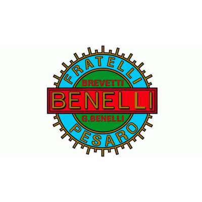
Roots of the Logo: The Fratelli Benelli Badge (1911–1925)
Benelli's first logo was every bit as bold as the young company's ambitions. It took the form of a vivid circular badge: a grass-green centre framed by a thick sky-blue ring, with a horizontal red banner carrying the "Benelli" name in gold, uppercase, sans-serif lettering. Fine gold accents and spoke-like details ran around the rim, giving it the busy, decorative look typical of early-20th-century Italian trade marks.
Two extra words arched around the frame told you exactly who and where this was: "Fratelli" — Italian for brothers — and "Pesaro", the Adriatic city where the widow Teresa Benelli had opened the family garage for her six sons. In other words, the very first Benelli logo was a statement of family and hometown pride: the Benelli Brothers, of Pesaro. Those roots have never entirely left the identity.

Transition to Elegance (1925–1932)
As Benelli graduated from repair shop to engine-builder and race winner, its badge grew more refined. The 1925 redesign stripped away the heavy blue outer ring and replaced it with a wreath of golden laurel leaves — the classical symbol of victory, and a fitting nod to the racing success the 175 was beginning to deliver. The green-and-red centre remained, but the lettering was tidied up to look more confident and professional.
Crowning the badge was a single five-pointed gold star, set where the two ends of the laurel wreath met, signalling excellence and the company's rising status. This was the first appearance of the star motif that would become a permanent fixture of Benelli's identity.

The Era of the Lion (1932–1951)
The 1932 redesign introduced the two elements most closely associated with Benelli to this day: the lion and the three stars. Sky blue returned, this time filling the background of the composition, while the circle stayed as the anchoring shape. Inside sat a light-blue field bordered by a dark-gold leaf frame, crossed horizontally by a red banner bearing the "Benelli" name in white for sharp contrast.
Below the banner stood a golden lion, poised with one paw raised — a symbol of strength, courage, and energy. Above it sat three gold six-pointed stars. Ornate, heraldic, and almost regal, this badge suited a company that was now winning national and international races and building a genuine reputation across Europe. It served Benelli for nearly two decades, through the triumphs of the 1930s and the hardship of World War II. The lion would soon echo through the model range, too, in the post-war Leoncino — literally "little lion."

Minimalism Takes Center Stage (1951–1972)
After the war, Benelli made a dramatic break with its ornate past. From 1951, the elaborate crest gave way to a simple italic wordmark: the "Benelli" name in a smooth, sloping custom script, rendered in white with a fine black outline, its letters flowing tightly together. Gone were the lion, the stars, the wreath, and the colour.
It was a clean, modern, professional look that matched the mood of Italy's austere but optimistic recovery years — and it appeared on the tanks of the era's most iconic Benellis, including the best-selling Leoncino. Understated to the point of plainness compared with what came before, it nonetheless gave the brand a contemporary, no-nonsense signature for the 1950s and 1960s.

A Modern Twist (1972–1995)
The 1972 update kept the wordmark-only approach but injected far more character. The script was replaced with a bespoke serif typeface in dark gold, drawn exclusively for the brand. Its most distinctive touches were the open contours of the two "E" letters and the diagonally cut, sharpened tops of the "L"s — small details that gave the logotype a crisp, forward-leaning, decidedly modern feel.
This gold serif wordmark carried Benelli through the turbulent De Tomaso years and the various ownership changes of the 1970s and 1980s, and the sharpened-letter styling it established still underpins the corporate typeface used on the badge today.

Embracing Tradition: The Silver Medallion (1995–Present)
In 1995, Benelli deliberately reached back into its own past, reviving the badge format and reuniting the lion, the stars, and the wreath in a single emblem — the basis of the logo still in use today. But the modern medallion has itself evolved through three distinct phases:
1995–2004 — The revived crest. A solid silver roundel framed by a green laurel wreath, with the white silhouette of the heraldic Benelli lion at the bottom, three five-pointed stars across the top, and the "Benelli" wordmark in bold black across the centre. The lion and stars were finished with a thin black outline that echoed the black lettering. It was a conscious blend of heritage and modernity, arriving just as Andrea Merloni set about relaunching the marque.
2004–2016 — Going three-dimensional. The redesign added silver gradients and gloss to give the roundel a polished, dimensional look, tucked the green wreath slightly inside the medallion, and placed the whole emblem above a bold black "Benelli" wordmark in the corporate serif — so the name appeared both inside the badge and beneath it. This is the era in which Benelli passed into Qianjiang ownership, and the more premium, sculpted badge suited a brand rebuilding its global image.
2016–Today — The refined medallion. The current logo is a gradient silver medallion with a green wreath around its inner perimeter, enclosing a walking white lion and three white stars with fine black outlines, and the "Benelli" name set across the middle in the brand's signature diagonally-cut serif. In some applications the badge stands alone; in others it sits beside the wordmark, and occasionally a silver stripe carrying the colours of the Italian flag is added to the right — a quiet reminder of the marque's Pesaro origins even under Chinese-Italian ownership.
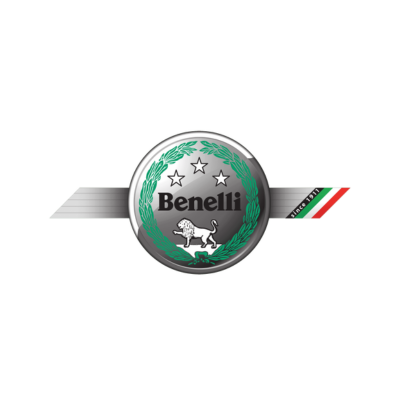
The Benelli Emblem and Symbol: Timeless Icons
Through every redesign, three symbols have defined Benelli's identity:
- The lion — the heart of the emblem, standing for strength, courage, and energy. It has featured since the brand's early decades and gave its name to the beloved Leoncino ("little lion") model.
- The three stars — a mark of excellence and ambition, first as a single star in 1925, then a trio from 1932 onward, pointing toward a successful future.
- The laurel wreath — the classical emblem of victory, reflecting Benelli's long and genuine racing pedigree, including two 250cc World Championships.
Colors and Fonts
The modern Benelli palette is built on green, silver, white, and black. Green is traditionally associated with growth and prosperity; white conveys loyalty and reliability; and the silver-and-black combination lends the badge a sense of sophistication and confidence. It is a deliberately restrained scheme compared with the fiery reds, blues, and golds of the pre-war crests.
The wordmark uses a custom serif typeface unique to the brand — an extra-bold, title-case face with softened serifs and the distinctive diagonal cuts on the horizontal bars of the "E"s that trace directly back to the 1972 redesign. The nearest commercial equivalents are often cited as Bookmania Black and Verona TS Bold, though Benelli's version is modified enough to remain unmistakably its own.
Benelli Logo FAQ
What does the Benelli logo mean?
It is a symbol of strength, victory, and heritage. The silver medallion conveys class and quality; the green laurel wreath and three stars represent achievement and ambition; and the lion stands for power, courage, and energy — a mascot that has accompanied the brand for most of its history.
What is the animal in the Benelli logo?
A lion, usually shown in white in the modern badge. It has symbolised the company's strength since its early years and inspired the name of the classic Leoncino ("little lion") motorcycle.
Why does the Benelli logo say 'Fratelli' and 'Pesaro'?
The earliest badge (1911–1925) read "Fratelli Benelli, Pesaro" — Italian for "Benelli Brothers, Pesaro" — honouring the six brothers who ran the company and the city where their mother founded it.
How many times has the Benelli logo changed?
There have been roughly six major eras — 1911, 1925, 1932, 1951, 1972, and 1995 — with the modern silver medallion itself refined again in 2004 and 2016.
What do the three stars mean?
The stars signify excellence and the promise of a successful future. Benelli began with a single five-pointed star in 1925 and adopted the now-familiar trio in 1932.
Is Benelli Italian or Chinese?
Benelli is an Italian marque, founded in Pesaro in 1911 and still headquartered there for design and development, but it has been owned since 2005 by China's Qianjiang Group (part of the Geely Holding Group). The occasional Italian-flag detail on the badge underscores its enduring Italian identity.