
The Only Marque Whose Name Is Arithmetic
Almost every motorcycle badge in Italy is a person, a place, or an animal. Ducati is a family. Moto Guzzi is a surname, plus an eagle adopted in memory of a founding partner killed flying. Benelli is six brothers and a lion. MV Agusta is a factory address — Meccanica Verghera — bolted onto the family name. Laverda, Gilera, Morini: all people.
Bimota is a sum.
Bianchi plus Morri plus Tamburini. Two letters each, in the order the three men happened to be standing in. It is close to the only badge in Italian motorcycling built out of arithmetic rather than a person, and — this is the part almost nobody mentions — it was not invented for a motorcycle company at all. In 1966 Valerio Bianchi, Giuseppe Morri and Massimo Tamburini started a firm in Rimini making heating and air-conditioning ducting, and that is the company they named Bimota. The first motorcycle was seven years away and nobody involved was planning one.
So the badge on a Tesi H2 is, in the most literal sense, the badge of a plumbing business.
What grew out of it is one of the most disciplined marks in motorcycling: a single lowercase b, drawn twice, nested, one ring inside the other. No animal. No shield. No wreath, crown, wings or founder's signature. Bimota built its entire reputation on bending steel tube into shapes other people couldn't, and it ended up with a logo that is, more or less, one continuous bent tube.
A note on sources before we go any further. Bimota has never published a brand chronology. The company's own heritage timeline runs from 1966 to the present without once mentioning the badge, and Kawasaki's corporate history of Bimota — written after Kawasaki took the brand on — doesn't mention it either. What circulates online instead is a single much-copied claim: that the logo dates from 1981, was designed by Massimo Tamburini, and first appeared on the DB1. That claim contradicts itself in two places, and this page used to carry it. The sequence below is reconstructed from the drawings themselves, from what the trademark register documents, and from what appears on period machines. Where the record is genuinely blank, it says so instead of inventing a date.
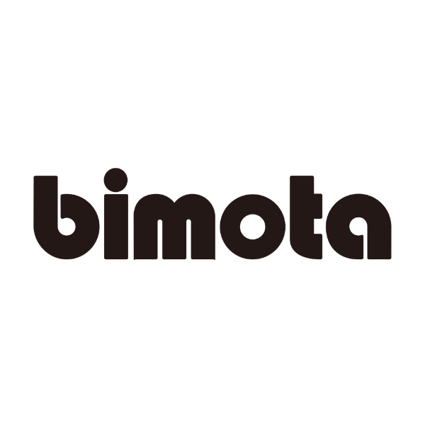
c.1973 — The Wordmark, and Nothing Else
In September 1972 Massimo Tamburini crashed a Honda CB750 at the fast Quercia bend at Misano and broke three ribs. He spent his convalescence deciding the problem had been the frame, and drawing a better one. The replica kits sold. In 1973 the ducting company was renamed Bimota Meccanica, and the HB1 — Honda Bimota 1 — followed, in a production run of ten. (Bimota's own timeline puts the HB1 at 1973; most other accounts date the ten-kit run to 1975. Both are defensible depending on whether you count the prototype or the customer bikes.)
The badge that went on it was the word, in lower case, and nothing else.
It is a very heavy rounded geometric sans of a kind that existed almost nowhere before 1969 and almost everywhere after it: every bowl a full circle, every stroke the same width, terminals cut flat, and a round dot over the i. The letters are pushed together until they touch, so the word reads as one continuous mass rather than six letters. This is the visual language of Blippo Black (Joe Taylor, 1969), Pump (Bob Newman, 1970) and ITC Bauhaus (1975) — the photo-lettering revival of unfinished Bauhaus geometry that defined how the early seventies looked. Whoever drew Bimota's wordmark was working squarely inside it, and tightened the fit by hand.
There is a reason a wordmark-only badge made unusual sense here, and it has nothing to do with fashion.
Bimota did not build engines. It built frames, and wrapped them around somebody else's motor — Honda, Suzuki, Kawasaki, Yamaha, Ducati — to the point that the model names are a code for whose engine is inside. HB, SB, KB, YB, DB. Every machine leaving Rimini therefore had a branding problem no other manufacturer had: two makers' names had a legitimate claim to the tank. Earlier bikes appear to have shared the tank with the engine supplier's name. It was not until the third series of the KB1 — the Kawasaki-engined bike that became the Tamburini era's biggest success, 827 built between 1978 and 1982 — that a Bimota went out with only the Bimota badge on the tank.
That is the real founding moment of the identity. Not a logo redesign; a decision to stop sharing the fuel tank.
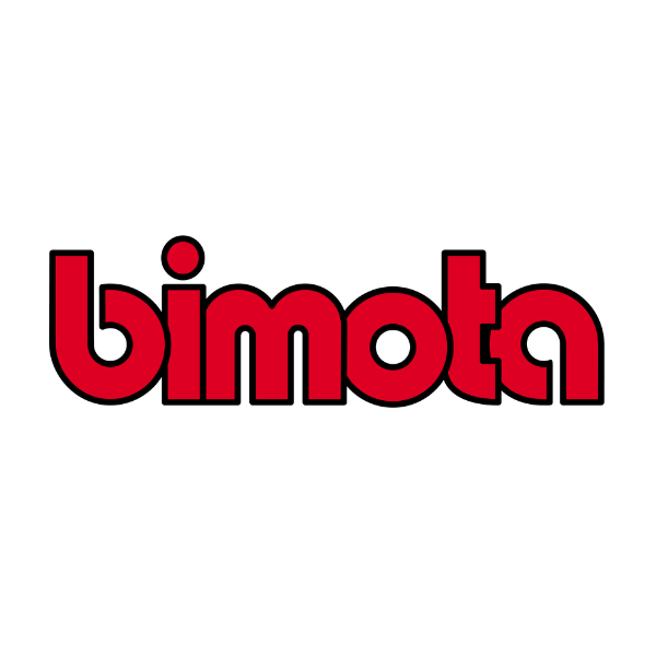
The Tank Decal — Red, With a Black Keyline
The same letterforms, filled in red and given a heavy black keyline around every stroke.
This is not a different logo. It is the same logo built for a different job, and the difference is instructive. A flat black wordmark works on paper and dies on paint: put it on a red tank and it fights the paint, put it on a dark tank and it vanishes. Adding a contrasting outline solves both at once — the mark keeps its shape against any colour underneath it, which is exactly what you need from a water-slide transfer applied by hand in a small factory to bodywork that might be red this month and silver the next.
Red arrives here and never leaves. Bimota has had no other primary brand colour since.
The keyline also does something the plain wordmark can't: it survives being small. On a fairing flank at speed, an outlined letter holds its edge where a solid one bleeds into the background. Plenty of marques that made their living on painted bodywork arrived at the same solution independently.
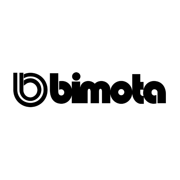
The b Arrives — a Monogram Drawn Twice
At some point the word acquired a symbol, and the symbol is the interesting part of this entire story.
It is a lowercase b: a straight vertical stem down the left side, curling at the foot into a ring that travels all the way round and stops just short of closing. And then the whole figure is drawn a second time, smaller, and set inside the first — two b's, concentric, sharing a centre. In this earliest all-black version both rings are the same weight and the same colour, so what you actually read at a glance is a spiral: a line that goes round, comes back, and keeps going.
Three things about it are worth pulling out.
It is a letter that behaves like a diagram. A conventional monogram sits still. This one has direction — the eye enters at the top of the stem, runs down, round the outside, and then finds itself on a second circuit. That is a coil, and it is very hard to look at a logo drawn by professional tube-benders, for a company whose entire product was a lattice of bent and welded steel wrapped around a bought-in engine, and not see the tube. Nobody at Bimota has ever said that is what it means. It is an observation about the drawing, not a documented intent, and anyone who tells you otherwise is guessing.
It is deliberately unclosed. The ring does not meet the stem. That gap is what stops the mark reading as a solid blob at small sizes, and it is preserved in every subsequent version — including the one Bimota uses today, where it is drawn to a hundredth of a unit.
It never replaced the word. Unlike Ducati, which spent a century swapping one emblem for another, or KTM, which eventually threw its symbols away entirely, Bimota simply added the b alongside the wordmark and then left both alone. The symbol has never been the whole logo and the word has never been dropped.
The wordmark beside it here is still the original: heaviest weight, letters touching, round dot on the i.
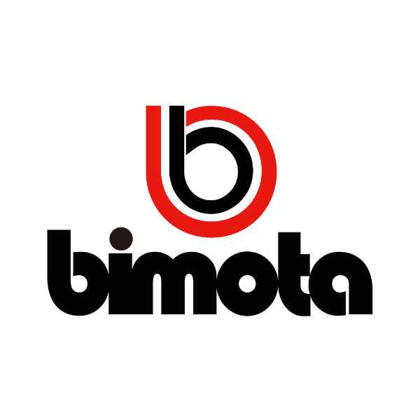
Red and Black, Stacked
Two changes, both consequential.
First, the two rings are given different colours — the outer b in red, the inner in black. The moment that happens the mark stops reading as a spiral and starts reading as depth: one letter sitting inside another, a shape with a front and a back. It is the single most recognisable thing about the badge today and it costs nothing to reproduce, because it is still just two flat colours with no gradient, no bevel and no shading.
Second, the lockup goes vertical. The symbol moves on top of the word instead of beside it, and the whole thing becomes roughly square.
That is a practical decision about motorcycles rather than a stylistic one. A horizontal lockup wants a long, narrow, uninterrupted surface, and a motorcycle has almost none — a fairing flank is interrupted by ducts and fasteners, a tank is a compound curve, a tail unit tapers. A squared-up stack drops into a fairing panel, a headstock, a clock face, a wheel hub or a dealer sign without redrawing. Most manufacturers eventually build both; Bimota's stack is the one that ends up on the bikes.
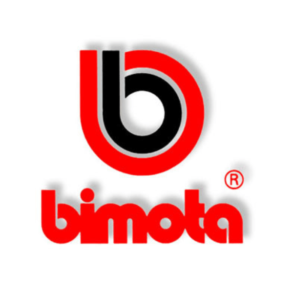
The Registered Years — Shadow, Keyline and an ®
Then the mark gets dressed up, and you can date this one on style alone.
The nested b picks up a light grey keyline between the red and the black, the whole lockup gains a soft drop shadow, the wordmark flips from black to red, and a ® appears at the wordmark's shoulder. Nothing has been redrawn; everything has been given a third dimension it didn't previously claim.
This is what happened to almost every logo in the world once artwork moved from a drawing board to a desktop. Bevels, shadows and highlights were free, so everyone used them, and for about fifteen years a flat mark looked cheap rather than confident. The Bimota version is a mild case — it keeps its shape and its two colours — but the shadow is a period stamp as reliable as a date code.
The ® is the tell that matters, though, because it is the one element here that is a legal claim rather than a decoration, and the register lets us check it. Bimota registered BIMOTA in the United States on 13 March 1984, on an application filed on 2 December 1982 that claimed first use in commerce back to 1 August 1977. A second US registration, filed in March 2005 and granted in January 2008, covered "the word bimota in stylized lower case lettering" — and the drawing attached to it is the original heavy rounded wordmark, still the registered mark in the mid-2000s, thirty years after it was drawn.
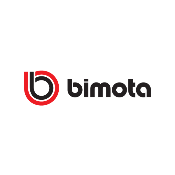
Present Day — Flat, Precise, and Kawasaki's
The badge Bimota uses now is the same idea, redrawn by people with different tools and a different brief. Every ornament added in the previous era has been removed, and the letterforms have been rebuilt.
The shadow is gone. The grey keyline is gone. The lockup is back to horizontal — symbol left, word right — and the wordmark is no longer the seventies fat rounded geometric. It is lighter, more open, and the letters no longer touch. Most tellingly, the dot over the i is no longer round: it is a small rectangle, wider than it is tall.
That last detail is not a guess. Bimota serves its own logo as a vector file, and you can read the geometry straight out of it.
Secondary and derived marks


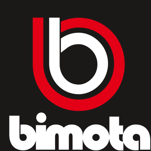
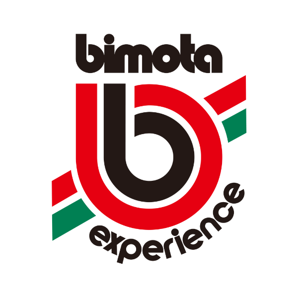
Those four are worth a sentence each, because they show what the mark is asked to do when it is not being the corporate logo.
The b with speed flashes takes the symbol on its own and cuts two angled bars across it, upper right and lower left, as though the letter were travelling fast enough to leave a wake. It is a livery graphic, not a badge — the kind of thing that goes on a fairing flank or a set of wheel rim tapes.
The tricolour version does the same thing in green and red against a black b, which is the Italian flag delivered without actually drawing a flag. It is the only place Bimota's identity says out loud where the bikes come from, and it says it in two small diagonal strokes.
The reversed lockup — red outer ring, white inner, white wordmark, on black — is the version that matters most in practice, because black is what a motorcycle, a paddock backdrop and a website header all tend to be. A badge whose inner element is black has to have an answer for this, and the answer is simply to swap the inner ring to white and leave everything else alone.
And Bimota Experience is the mark doing sub-brand duty: the wordmark above, the nested b enlarged in the middle with tricolour flashes either side, and "experience" curved around the foot in the same rounded letterforms. It is the busiest thing Bimota's identity has produced, and it is instructive precisely because it sits at the limit — add anything else and the mark stops working.
What the Modern Logo Is Made Of
Bimota's own website serves the current logo as an SVG, which means the mark's construction is a matter of record rather than of eyeballing. Here is what is in the file.
The red is #ED1D24. A bright, slightly orange-leaning scarlet — a long way from Ducati's oxblood #B00E0A, and closer to a flag red than a wine red. It is the only colour value declared anywhere in the file; the inner ring and the wordmark are drawn in currentColor, meaning they inherit whatever the surrounding context is. That is a deliberate, modern piece of engineering: the black-on-white and white-on-black versions are not two files, they are one file behaving correctly in two places.
The symbol is a perfect square. The full lockup is 124 units wide and 34 tall, and the b occupies the first 34 of them — a 34 × 34 box, with the word occupying the remaining 90 — symbol to wordmark in a ratio of roughly 1 : 2.6.
The two b's are concentric and identically weighted. The outer ring is a circle 34 units across; the inner is 23. Both are drawn with a stroke of 3.85 units — about 11 per cent of the outer diameter. Same pen, two sizes. That equal weighting is why the mark reads as one object at any size instead of a big letter with a small one trapped inside it.
Both rings stop short of closing. The stem runs down the left, the bowl comes round, and there is a deliberate gap at the top. This is the detail that keeps the badge legible at the size of a key fob.
The tittle is a rectangle. The dot over the i is 4.2 units wide and 2.4 tall — a flat rectangle, not a square and emphatically not a circle. It is the one piece of eccentricity in an otherwise unremarkable geometric sans, and it does the job every good custom detail does: it makes the letterforms Bimota's rather than a typeface's, and it echoes the flat-cut terminals elsewhere in the word.
Everything is lowercase. There is no capital letter anywhere in the identity and there never has been. On a badge that is already dominated by a circle, a capital B would introduce a second, conflicting vertical mass; the lowercase word stays low and wide and lets the symbol carry the height.
What the Trademark Record Shows
This is the only part of the story that is documentary rather than interpretive, and it turns out to trace the company's fortunes with unnerving precision.
Registration 1,269,735 — the word BIMOTA, filed 2 December 1982, registered 13 March 1984, claiming first use in commerce from 1 August 1977. Filed as a typeset word mark: the word in any typeface, not a specific drawing. Cancelled on 25 March 2016 for failure to file the required declaration of continued use.
Registration 3,373,859 — "the word bimota in stylized lower case lettering", colour not claimed, filed 31 March 2005 by Bimota S.r.l. of Milan, registered 22 January 2008. Cancelled on 29 August 2014, same reason.
Registration 7,741,494 — BIMOTA in standard characters, filed 21 August 2023 under international registration 1,770,566, registered 1 April 2025. The owner of record is Kawasaki Motors, Ltd., of Akashi, Hyōgo, Japan.
Read those three in order and you have the company's last forty years without a word of narrative. A marque that had been selling in America since 1977 protects its name in 1982. It refreshes that protection with a proper stylised drawing in 2005 as part of the post-bankruptcy relaunch. Then it stops paying attention: the stylised mark lapses in 2014, the word mark lapses in 2016, and for nine years there is no live Bimota registration in the United States at all — a stretch that brackets the years the company effectively stopped building motorcycles. The register goes quiet at roughly the moment the factory does.
And when the name comes back, in August 2023, it comes back in Kawasaki's name.
None of which is an invitation to reproduce the mark. BIMOTA and the nested-b device are protected trademarks, and the current US registration sits with Kawasaki Motors, Ltd.
What People Get Wrong
"The logo has been used since 1981, was designed by Massimo Tamburini, and first appeared on the DB1." This is the single most-copied claim about the Bimota badge and it cannot be true as written. The DB1 was launched in 1985, not 1981 — and its chief engineer was Federico Martini, who joined from Ducati after Tamburini left for Cagiva in 1983. A logo cannot both date from 1981 and debut on a 1985 model, and Tamburini was already gone by the time that model existed. Earlier versions of this page carried the claim; it has been removed rather than tidied up.
"Bimota was founded in 1983." No. That is roughly the year Tamburini left. The company was named in 1966 (as a heating and air-conditioning business), renamed Bimota Meccanica in 1973, and sold its first motorcycles from 1973 to 1975 depending on whether you count the prototype or the ten-kit HB1 production run. Bimota's own heritage timeline and Kawasaki's corporate history both start at 1966; Wikipedia and much of the press start at 1972 or 1973. All three dates are defensible for different events. 1983 is not one of them.
"Bimota was the first motorcycle manufacturer to use a lowercase b as its central element." No source supports this and it is not the sort of claim anyone can actually check — it would require surveying every badge used by every manufacturer worldwide before roughly 1980. It is an unfalsifiable superlative, and it should be read as marketing rather than history.
"The logo has never changed." It has changed considerably. The wordmark alone has been redrawn at least once, comprehensively: the original is far heavier, its letters touch, and its i carries a round dot, while the current one is lighter, spaced, and dotted with a rectangle. What has never changed is the idea — a lowercase word and a nested b, in red and black — and that continuity is genuinely unusual. Continuity is not the same as stasis.
"Tamburini designed the Ducati 916, so the Bimota b influenced the Ducati logo." The first half is true: after leaving Bimota in 1983 for Cagiva, Tamburini designed the 916 and later the MV Agusta F4. But he was a designer of motorcycles, not of badges, and there is no evidence he had anything to do with Ducati's corporate marks. The Ducati logo went its own way — through wings, an elephant and a coffee-bean D — for reasons that have nothing to do with Rimini.
The Badge That Outlived the Company
The most remarkable thing about the Bimota mark is not its design. It is that it survived at all.
The 500 V Due, launched in 1997, was a direct-injection two-stroke that did not work, and the recall that followed took the company down with it: sponsors walked during the 2000 season and Bimota went bankrupt in 2000–2001. In 2003 a Milanese investor restarted it. Ownership moved to Switzerland, the Rimini premises were run down, the trademarks lapsed in 2014 and 2016, and by 2017 the marque was, for practical purposes, a name that nobody was using.
Then in April 2019 Kawasaki Motors Europe set up a new company at Cerasolo, just outside Rimini, to build motorcycles under the Bimota name. The Tesi H2 was shown at EICMA that November, the KB4 followed, and in 2025 the badge went back on a factory World Superbike fairing for the first time in a quarter of a century as bimota by Kawasaki Racing Team, with Alex Lowes and Axel Bassani on the KB998 Rimini. Lowes took four podiums in that first season and finished sixth in the championship. The marque's only World Superbike race win remains Anthony Gobert's, in the wet at Phillip Island in 2000, on a Suzuki-engined SB8R.
That is the context that makes the badge's stubbornness make sense. Bimota has been rebuilt from scratch more than once, under several sets of owners and in more than one country, and it has changed the thing it sells — from frame kits, to complete motorcycles, to a Kawasaki-powered halo brand. The nested b is the only object that has been present the entire time.
Most marques treat their badge as a summary of what they are. For long stretches of the last twenty-five years, Bimota's badge was the only part of Bimota still functioning — a piece of intellectual property waiting for a factory to be attached to it. It got one. Twice.
What does the name Bimota mean?
It is a portmanteau of the founders' surnames — Bianchi, Morri, Tamburini — two letters each. Valerio Bianchi, Giuseppe Morri and Massimo Tamburini coined it in 1966 for a heating and air-conditioning ducting business in Rimini. The company was renamed Bimota Meccanica in 1973, when it started building motorcycle frames.
What does the b in the Bimota logo represent?
Literally, the first letter of the company's name. It is drawn as a lowercase b — a vertical stem and an almost-closed ring — and then repeated at a smaller size inside itself, so the two rings share a centre. The nesting is what makes it distinctive; Bimota has never published an explanation of it, and any account you read of a hidden meaning is interpretation rather than fact.
What colours does the Bimota logo use?
Red and black, or red and white when reversed out of a dark background. The red in Bimota's own current logo file is #ED1D24 — a bright, slightly orange-leaning scarlet, noticeably lighter than Ducati's deep #B00E0A. Some livery versions add green alongside the red for the Italian tricolour.
What font is the Bimota wordmark?
Bimota has never named one, and there are two different wordmarks to account for. The original is a very heavy rounded geometric sans in the family of Blippo Black, Pump and ITC Bauhaus — the photo-lettering style of the late 1960s and early 1970s — with the letters tightened until they touch. The current one is lighter and more open, with the letters separated and a rectangular rather than round dot over the i. Both look hand-adjusted rather than typeset, which is normal for a mark a company intends to defend.
When did the Bimota logo change?
There is no published chronology, and any source giving you exact changeover years is guessing. What can be said from the evidence: the earliest badge was the wordmark alone; the nested b was added alongside it rather than replacing it; a dimensional version with a drop shadow and a grey keyline belongs to the desktop-publishing era; and the current flat, redrawn version is the one Bimota serves from its own website today. The stylised wordmark registered with the US Patent and Trademark Office in 2008 was still the original 1970s drawing.
Did Massimo Tamburini design the Bimota logo?
It is widely claimed and nowhere documented. Tamburini was one of the three founders and Bimota's lead motorcycle designer until 1983, so he is a plausible candidate — but neither Bimota nor Kawasaki has ever said so, and the version of the claim that circulates online also dates the logo to 1981 and to the DB1, a 1985 model designed after Tamburini had already left. Treat the attribution as unverified.
Who owns the Bimota trademark now?
The live United States registration for BIMOTA is held by Kawasaki Motors, Ltd. of Hyōgo, Japan, filed in August 2023 and registered on 1 April 2025. Bimota's two earlier US registrations, held by the Italian company, were cancelled in 2014 and 2016 for failure to file declarations of continued use — during the years the marque was dormant.
Why doesn't Bimota have an animal or a crest like other Italian marques?
Because it never was that kind of company. Moto Guzzi's eagle, Benelli's lion and Ducati's various emblems all belong to manufacturers selling heritage and volume to a general public. Bimota sold frames to people who already knew exactly what a frame was — a few hundred machines a year, to an audience that needed no persuading by a symbol. A word and a letter were sufficient, and they have stayed sufficient for fifty years.
Check out the History of Bimota , Bimota Models and Values , and our curated Bimota Apparel and Gear .