Most motorcycle logos were drawn by a designer. Norton's was drawn by a family.
Before the First World War, Nortons carried their name in tall, slightly theatrical capitals. Then, around 1913–14, the company's founder, James Lansdowne Norton, and his daughter Ethel produced the flowing script that the world knows as the "curly N". It first appeared on a catalogue for 1914 and on the motorcycles from 1915. For the next hundred and ten years, through the Bracebridge Street works, AMC, Norton-Villiers, the rotary years, a bitter fight over the name in America, the Donington revival and TVS, it stayed essentially the same drawing.
In November 2025 Norton replaced it. This page follows the logo from the first "NORTON" transfers to the new mark. It is built on primary material where we could find it: period Motor Cycle adverts, photographs, Norton's own statements and the US trade mark register. Where the popular story is wrong, we say so. For the company story, see our history of Norton.
The Short Version
- 1898: James Lansdowne Norton, known as "Pa", founds the Norton Manufacturing Company in Birmingham to make cycle chains and fittings.
- 1902: The first Norton motorcycle, the Energette, is advertised in plain type. There is no logo.
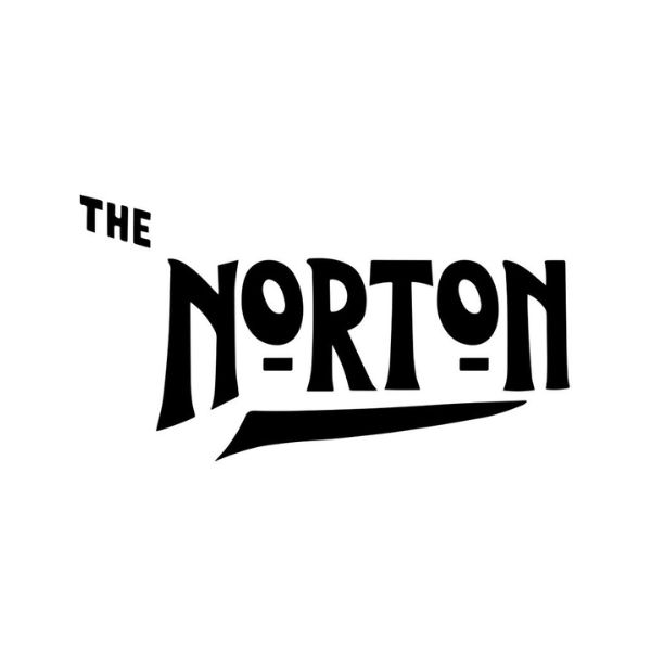
- c.1905–1913: Tanks carry "NORTON" in tall Art Nouveau capitals with a small raised O and a swash underline. Restored machines show it as "THE NORTON".
- 1913: The old company fails and Norton Motors Ltd is formed, with Pa Norton and Bob Shelley as directors.
- c.1913–15: Pa Norton and his daughter Ethel design the curly N. It is on the catalogue for 1914 and on the machines from 1915.
- By 1923: The script is printed as a registered trade mark, under the slogan "The Unapproachable Norton".
- 1920s–1960s: The curly N appears as a black tank transfer on silver, gold on military machines, and from 1956 on tank badges.
- 1967–68: The first Commandos wear round Norton-Villiers badges; the script comes back on its own soon after.
- 2010: Carter Wong Design redraws the curly N for the Donington-era company, removing the t's second crossbar.
- 4 November 2025: Under TVS, Norton unveils an all-new logo: a sharp, italic "Norton" with no looping tail.
1898–1913: THE NORTON
James Lansdowne Norton set up the Norton Manufacturing Company in Birmingham in 1898, at the age of 29. It made chains and other parts for the cycle trade. Most histories place it in Bradford Street; period adverts use both Bromsgrove Street (November 1902) and Bradford Street (February 1903), so the company probably occupied more than one address in its early years.
The first Norton motorcycle, the Energette of 1902, used a small French Clément engine clipped to a bicycle frame. Norton's own history gives it 143cc; other sources say 147cc or 160cc. What matters here is how it was sold: the Motor Cycle adverts of 1902 and 1903 call it "The NORTON MOTOR BIKE" in ordinary display type. At this point Norton had a name, not a logo.
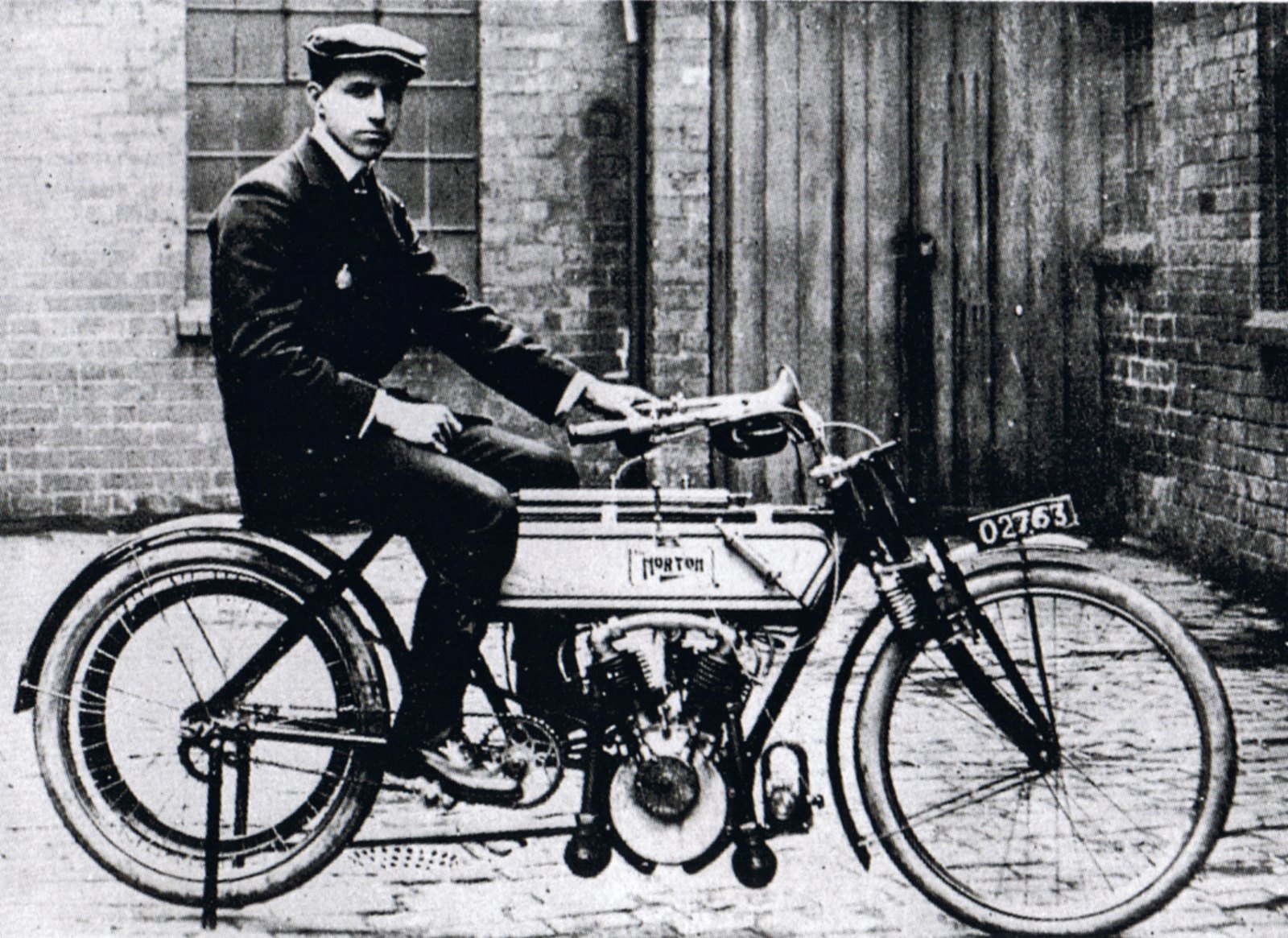
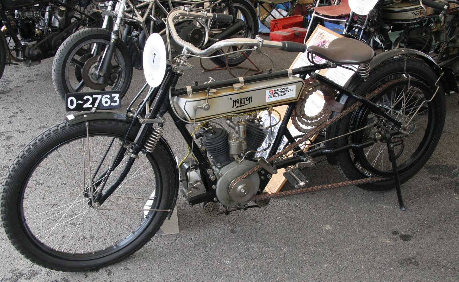
The first real logo came within a few years. According to Bob Holliday's Norton Story, quoted by Wikipedia, it was "a fairly simple, Art Nouveau design, with the name spelled in capitals". You can see it on the most famous early Norton of all, the Peugeot-engined twin on which Rem Fowler won the twin-cylinder class of the first Isle of Man TT in 1907:
- In a period photograph of Fowler on the machine (below), the tank carries NORTON in a small lined panel. The letters are tall and condensed; the O's are small and raised; a short swash sits under the middle of the word.
- The same machine today, at the National Motorcycle Museum near Birmingham, carries "THE NORTON": a small "THE" above and to the left, the same tall NORTON, and a longer swash underneath. This is the version on the left.
We cannot see a "THE" in the grainy 1907 photograph, and the surviving machine has been restored, so its transfer is a restorer's reproduction. What the two do show is that the tall-capitals NORTON was on the tank by 1907. The "THE" was a common habit of the period ("The Norton", "The Triumph") and it appears on other restored early Nortons, including the 1905 machine at the Sammy Miller Museum, often described as the oldest surviving Norton. We have not found a dated catalogue that says exactly which years used it.
A 1908 Motor Cycle photograph of a Norton engine shows a cast plate on the chaincase with NORTON in plain capitals. The name, in other words, was lettered in more than one way before 1914.
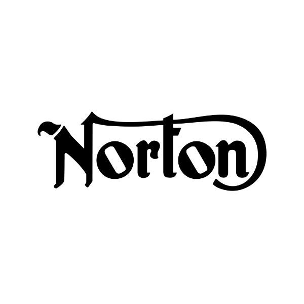
1913–1915: Pa, Ethel and the Curly N
In 1913 the Norton Manufacturing Company ran out of money. Its main creditor, R. T. Shelley & Co., stepped in, and a new company, Norton Motors Ltd, was formed with James Norton and Bob Shelley as joint directors. At about the same time the company got a new signature.
Who drew it. Norton's own history, under the heading "1913 – The Iconic Logo Born", says: "James Norton and his daughter Ethel design the famous Norton logo, featuring the legendary N-T connection that would become globally iconic." Mick Woollett's Norton: The Complete Illustrated History, as cited by Wikipedia, gives the same pairing: the new logo "was a joint effort by James Norton and his daughter Ethel". The Classic MotorCycle credits Ethel alone. A 2010 Design Week article, reporting the redesign described further down, says only that the mark "is believed to have been developed by founder James Landsdowne Norton".
Who Ethel was. The 1911 census, quoted by Grace's Guide, lists Ethel S. Norton, aged 10, born in Birmingham, in the Norton household. If the logo dates from 1913–14, she was about twelve or thirteen when she helped to draw it.
When. The sources give three dates, and they fit together:
- 1913: the design, according to Norton. A catalogue for the 1914 season would have been prepared during 1913.
- 1914: the logo "appeared on the front of the catalogue for 1914", according to Woollett.
- 1915: its first appearance "on actual motorcycles", also according to Woollett.
The timing, alongside the new company, suggests the logo was part of a fresh start. No source says so directly.
What it looks like. The curly N is a hand-drawn script, not a typeface. Its features are:
- a heavy, black-letter N with a small flag at its top left;
- a long, fine stroke that leaves the top of the N and runs across the top of the word, forming the crossbar of the t (Norton's "N-T connection");
- a tail that curls down around the final n, closing the word like a bracket.
Is there a story of Pa and Ethel sketching it at the kitchen table? It is repeated online, but we have found no source for it. The joint credit is well sourced; the kitchen table is not.
Registered. By August 1923 the script was printed in Motor Cycle adverts with "REGD TRADE MARK" beneath it. Reproduction transfers for the period carry the same small wording.
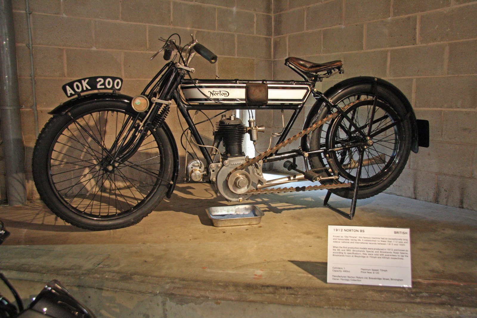
1915–1950s: The Unapproachable Norton
For forty years the curly N was the whole of Norton's identity, and it was almost always applied as a transfer on the side of the tank.
The slogan came first. "Unapproachable" is older than the curly N. In June 1908, after the TT win, Norton advertised a testimonial believed to be from Rem Fowler: "My success is due to my unapproachable Norton." It became a slogan. A May 1918 advert used "Unapproachable Norton", and by the 1920s adverts set the curly N under the words "The Unapproachable". It was still there in 1952, alongside a newer claim, "The World's Best Road Holder", for the featherbed frame.
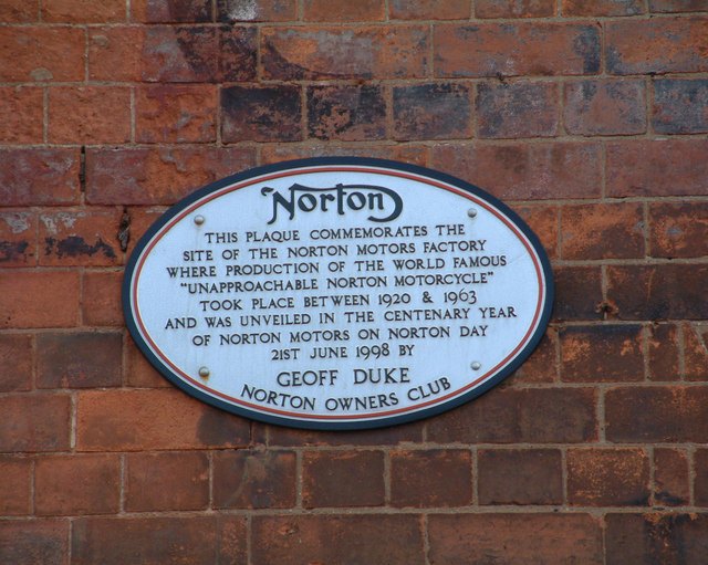
The factory. From about 1920 the works was in Bracebridge Street, Aston, Birmingham. The plaque on the site, unveiled by Geoff Duke and the Norton Owners Club in 1998, dates production there to "between 1920 & 1963" and calls the bikes built there "the world famous 'Unapproachable Norton' motorcycle".
How the logo was applied:
- Colour. Civilian machines usually had a black curly N on the tank; military (WD) machines had gold ones, according to a WD Norton specialist. Smaller gold transfers were used on the top of the tank, the mudguard and the chaincase.
- Shape. Reproduction suppliers sell two main tank transfers: a more "scrolled" version for the flat-tank models up to the late 1920s and a second one for the late 1920s to the 1960s. The Norton Owners Club's own members note "so many small changes to the script" over the years. There was never one master drawing applied identically to every tank.
- The t. According to Creative Review, quoted by Wikipedia, the t gained a second crossbar of its own around 1924, so the N's stroke and a short bar both crossed it. The 2010 redesign took that second bar away.
- Livery. The curly N sat most famously on a silver tank with black and red lining, the look of the overhead-camshaft Internationals and the Manx racers. Owners disagree about exactly when the red line moved inside the black; treat any single rule with caution.
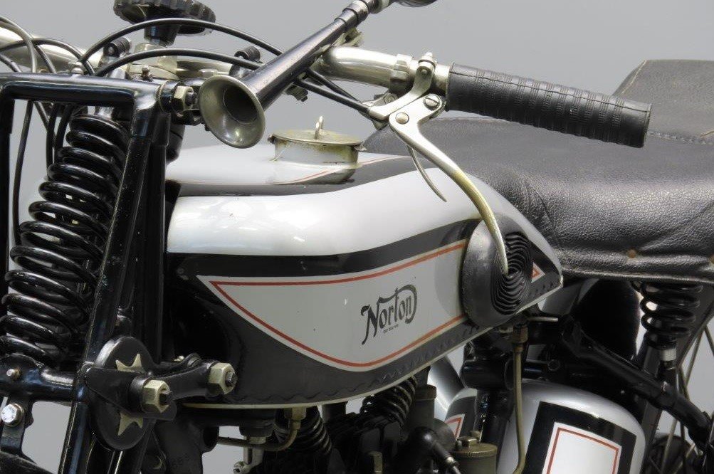
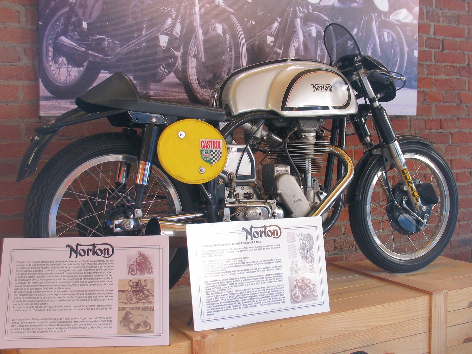
1953–1966: AMC and the Tank Badge
In 1953 Norton was bought by Associated Motor Cycles (AMC), owner of AJS and Matchless. The logo did not change. What changed, a few years later, was how it was fixed to the bike.
The badge arrives. A Motor Cycle advert of 15 November 1956, headed "The 'Smooth-Look' is here", shows the Model 50 with detachable panels on the tank and a round tank badge in place of the transfer. Owners report round plastic badges on 1956–57 singles, and some machines with AMC-type chrome badges.
Through the 1960s the badges multiplied:
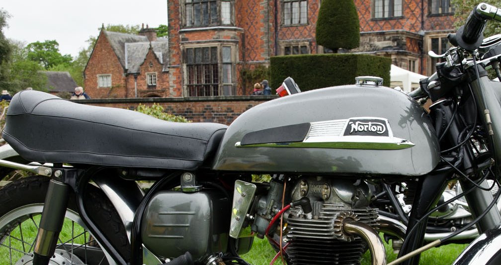
- Long chrome "flash" badges. On the Atlas and the later Dominators, the curly N sits in chrome on a black plate at the end of a ribbed chrome strip, as on the 1968 650SS below.
- Painted badges. On two-tone slimline Dominators, owners describe badges painted in the colour of the tank, with the raised lettering left in chrome.
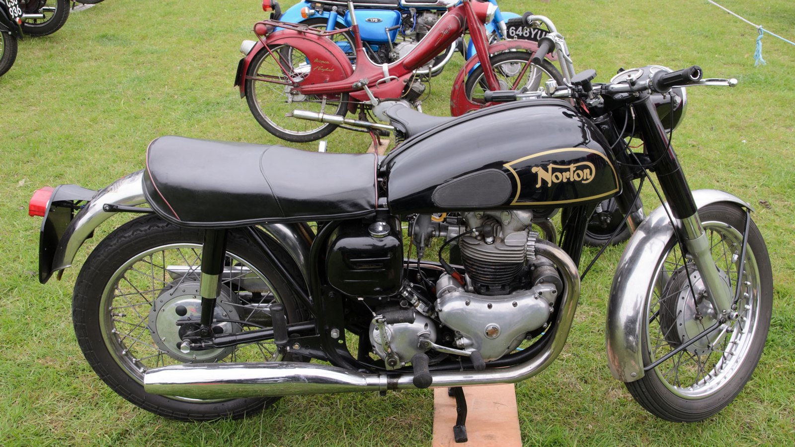
- Transfers carry on on many models, like the 1956 Dominator 88 below, with a gold curly N on a black tank.
Plumstead. AMC closed Bracebridge Street and moved Norton production to its works at Plumstead, in south-east London, in 1962–63. An advert of November 1961 still shows the classic curly N with the Bracebridge Street address. We found no evidence of a redesign in 1953, 1961 or 1962, whatever the logo websites say.
1966–1977: Norton-Villiers, the Commando and NVT
AMC collapsed in 1966 and was reformed as Norton-Villiers, part of Manganese Bronze Holdings. Its first new motorcycle, the Commando of 1967, was styled with help from the London consultancy Wolff Olins, and for a moment the curly N looked vulnerable.
The green blob. Classic Bike Guide's account of the Commando's birth describes the stylists' worry that "the green blob on the fuel tank" would not be "recognised by Norton fans as the symbol of their favourite marque". The green globe badge appeared on the styling model and early show machines. According to owners who have studied the early bikes, no production Commando wore it.
Round badges, then the script again. The first production Commandos of 1967–68, the Fastbacks, had round Norton-Villiers badges set into recesses in the tank and the tail. By the end of the 1968 model year or the start of 1969 the badges were gone, and the parts book for 1969–70 shows no recess for them. From then on the Commando carried the curly N as a transfer in the traditional way, in black, white or gold depending on the paint.
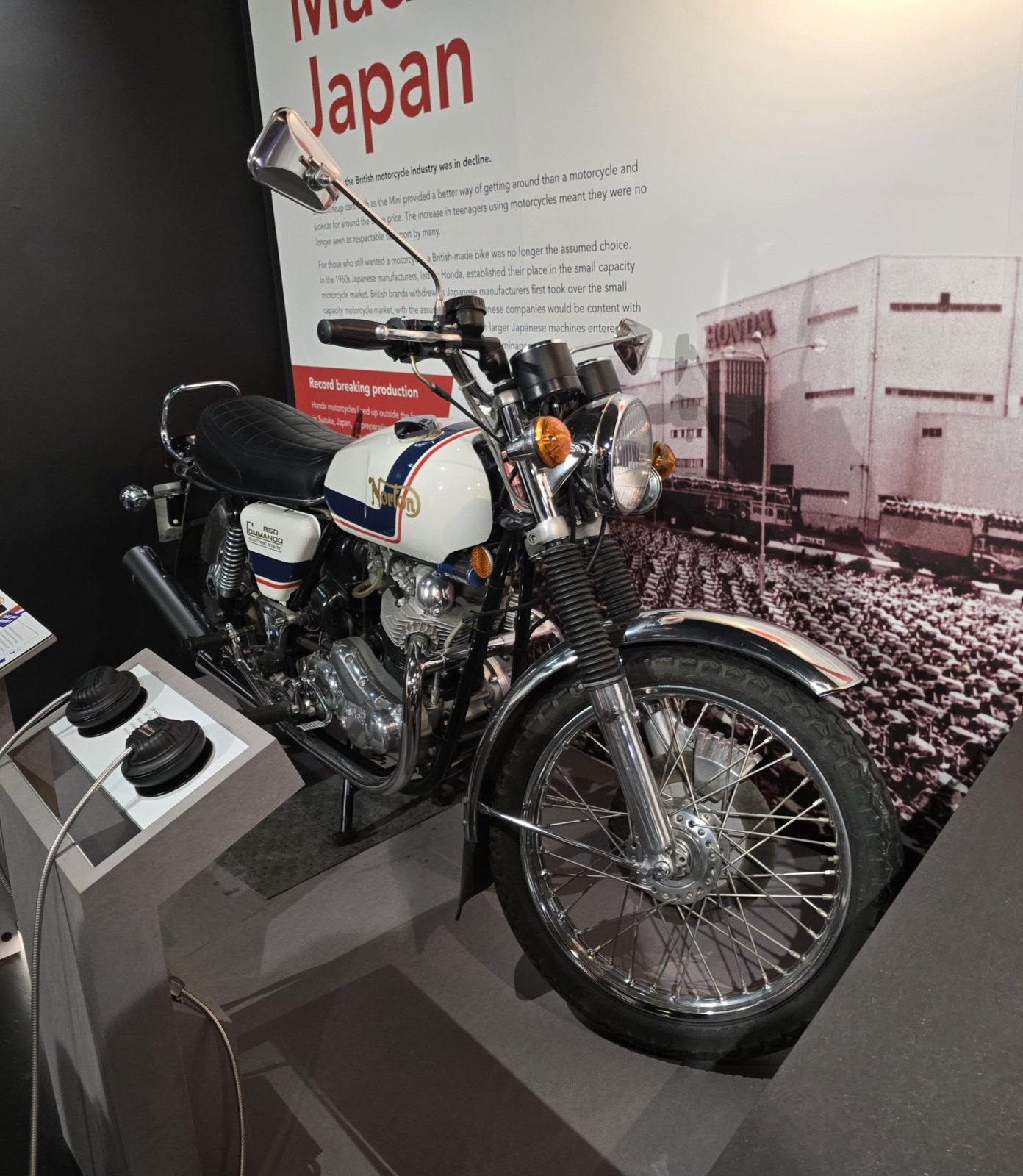
NVT. In 1973 Norton-Villiers merged with the remains of BSA-Triumph to form Norton Villiers Triumph (NVT). NVT had corporate lettering of its own, but the motorcycles kept the curly N: the 850 Commando of 1977 below carries a gold script on a white tank with red and blue stripes. We have not found a reliable record of the Norton-Villiers or NVT corporate logos themselves, and we do not show them here.
1978–2008: Rotaries, Racing and a Fight Over the Name
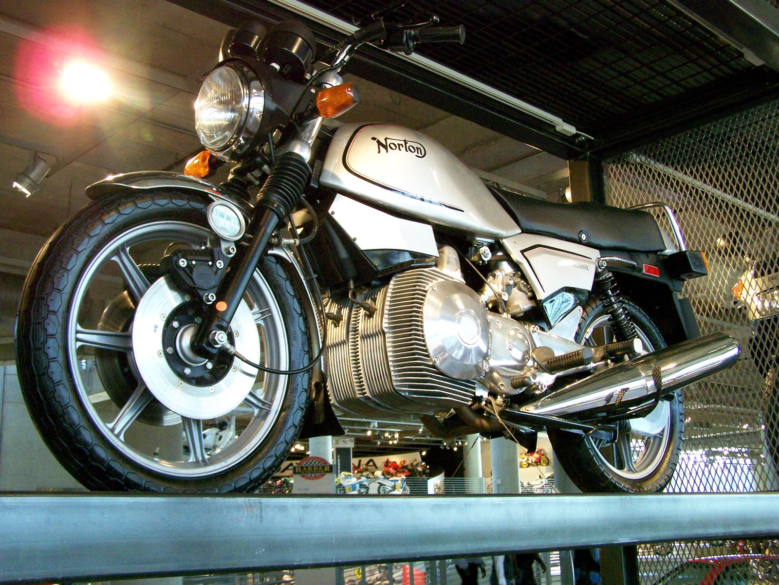
The Commando ended in 1977, but the name survived. Norton Motors (1978) Ltd, based at Shenstone near Lichfield, built motorcycles with Wankel rotary engines, and every one of them wore the curly N:
- Interpol 2 (1984): police machines, with a black curly N on the white fairing.
- Classic (1987): a run of about 100, in Hagerty's words with a "curly-script logo on a traditional paint finish of silver with black pinstripes". It was a deliberate look back to the pre-war tanks.
- Commander (1988): the touring rotary.
- F1 (1990): designed by the London agency Seymour Powell and sold in only one livery, black with gold decals and grey and gold stripes, recalling the John Player sponsorship of the rotary racers. On the F1 the curly N is gold.
The name splits. From the 1990s the Norton name was owned, licensed and disputed across several countries at once. The Canadian financier Nelson Skalbania and his partners formed Norton Motors (1993) Ltd; in 1997 Norton Motors (Deutschland) registered the trade mark in several European countries; and in Portland, Oregon, the restorer Kenny Dreer was building his own new Commando. When Dreer was sent a cease-and-desist letter over "the names and logos of Norton and Commando" in 1999, he fought it, and after four years his company, renamed Norton Motorsports, acquired the Norton trade mark rights for the US, then the European rights. His 952 and 961 Commandos kept the curly N.
On the register. The US record shows how widely the script was claimed:
- a stylised curly N for riding clothing, filed on 1 April 1991 and registered on 29 July 1997 (No. 2,084,188);
- a curly N "NORTON" design mark for motorcycle parts, filed in 1998 by Norton America LLC of Gladstone, Oregon, and registered in 2006 (No. 3,145,777).
Both are still live, and both are now owned by The Norton Motorcycle Co. Limited in Solihull.
2008–2020: Donington and the 2010 Redraw
In late 2008 the British businessman Stuart Garner bought the Norton rights from their American owners and brought production back to Britain, at Donington Hall in Leicestershire. The first bike was a revised Commando 961.
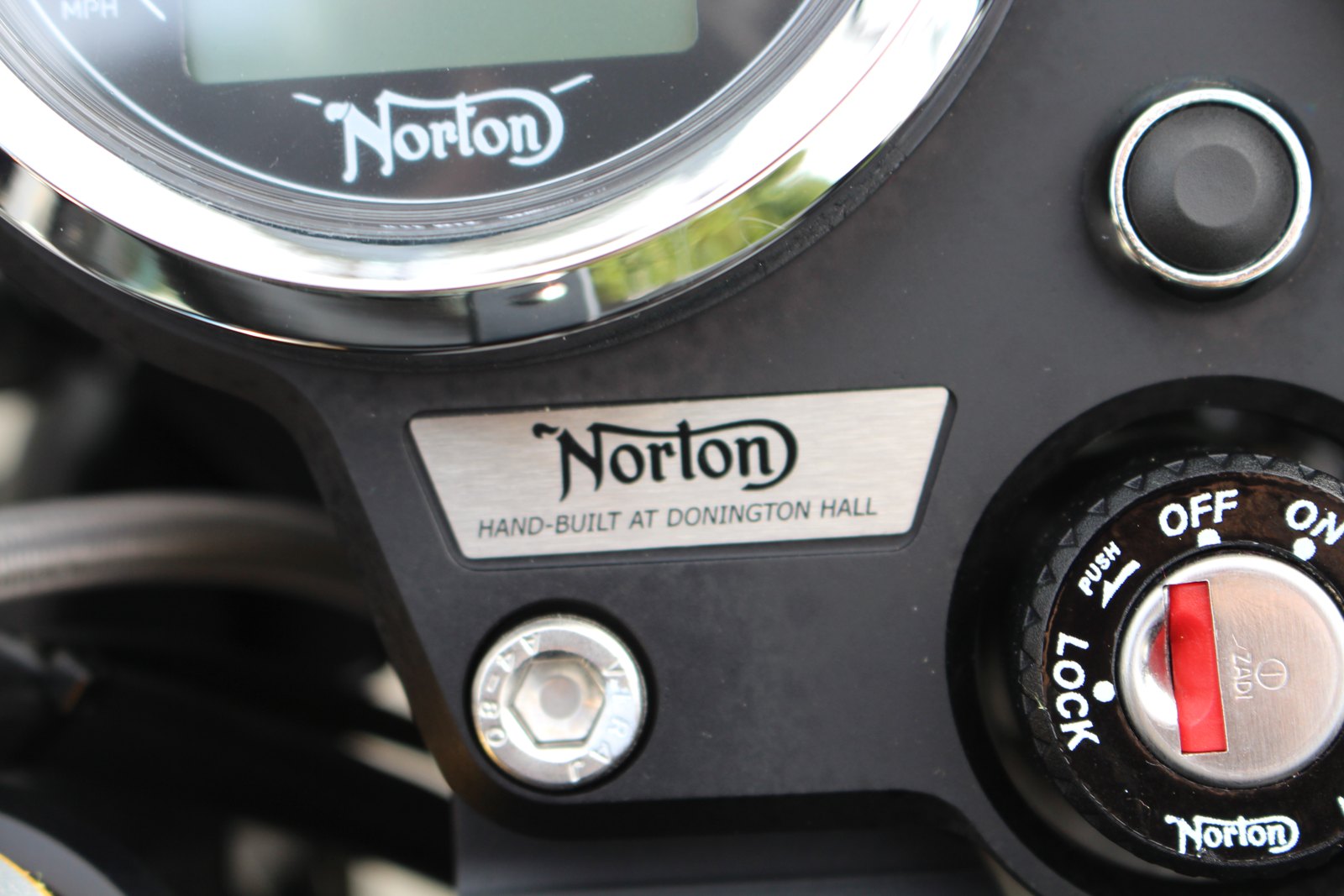
In November 2010 the London agency Carter Wong Design cleaned up the logo. Its account, reported by Design Week and the insurer Adrian Flux's blog, was that the script had picked up "awkward shapes, nuances and curves" over the decades. The main change: "doing away with the double crossing of the letter 't'. Now the 't' is crossed by the 'dynamic swoosh' from the 'n', which Carter says brings the design closer to the original." The typographer Geoff Halpin worked on the lettering.
In other words, the 2010 redraw was a restoration rather than a new logo. It went back to Pa and Ethel's single crossing of the t and left everything else alone. It appeared on the Donington bikes' tanks, instruments and the aluminium plate reading "Hand-built at Donington Hall".
The Donington company entered administration in January 2020.
2020–Present: TVS and the 2025 Logo
On 17 April 2020 India's TVS Motor Company completed its purchase of the Norton brand and certain assets of the business in administration, for £16 million in cash. A new headquarters and factory at Solihull, a few miles from where Pa Norton started, opened on 11 November 2021. For five years the Commando 961 and the V4SV kept the 2010 curly N.
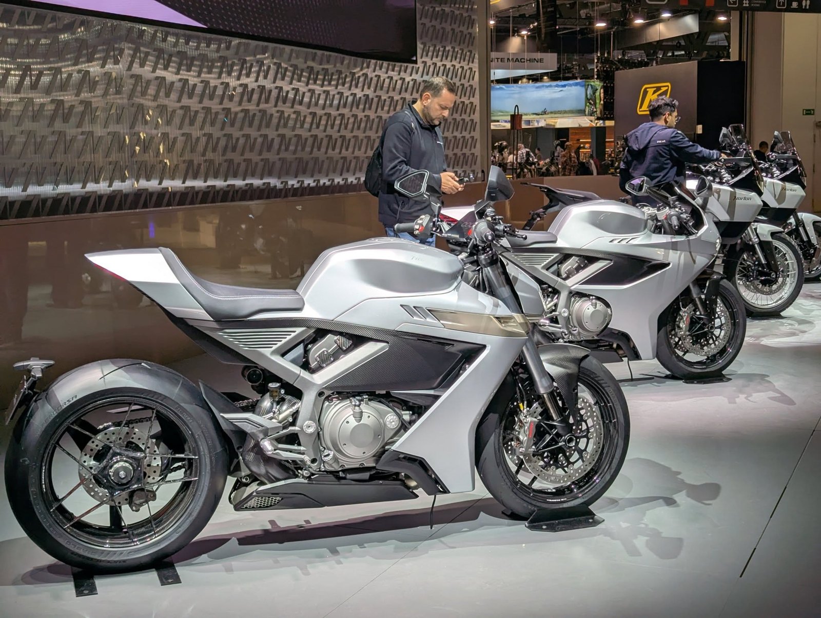
The new logo. On 4 November 2025, at the EICMA show in Milan, Norton unveiled four new models, the Manx R, Manx, Atlas and Atlas GT, and a new identity. Its press release: "Norton's Resurgence is celebrated by its all-new logo, a forward-looking and visually relevant interpretation of the brand's ethos that's faithful to Norton's past but befitting for a new age for Norton." The design direction was led by Gerry McGovern, formerly design chief at Jaguar Land Rover and now Norton's chief creative adviser, working with Simon Skinner, Norton's head of design. The release does not name a logo designer or agency, and neither do we.
What changed. Norton has published no description of the design. Comparing it with the curly N, as it appears on Norton's website:
- the lettering is heavily italic, sharp-edged and of even weight: a drawn, geometric "Norton" rather than a pen-made script;
- the N still sends a stroke across the top of the word, and the t still hangs from it: the "N-T connection" survives;
- the curl around the final n is gone, and with it the black-letter N and its flag.
On the EICMA stand the backdrop was a wall of a repeated, angular N, suggesting the letter is being used on its own as a monogram. Two figurative UK trade marks filed by The Norton Motorcycle Co. Limited on 10 June 2025 may cover the new identity, but we have not been able to see the images.
The old logo is still protected. Norton keeps its curly N registrations alive, and a US application filed in October 2024 for "the word NORTON in stylized font", still pending, shows the classic script. Expect to keep seeing the curly N on heritage products and the older models.
Lettering and Colour
It was always a signature. From 1915 to 2025 the curly N was not set in a typeface and never had a matching alphabet. It was a single drawing of one word, and each transfer maker, badge supplier and designer copied it by hand. That is why the script varies slightly from bike to bike, and why the 2010 redraw was needed at all.
The N-T connection. The detail Norton itself singles out is the stroke from the N that crosses the t. It was single in the original, doubled from about 1924, single again from 2010, and it is the one feature the 2025 logo keeps.
No official colour. The curly N has been black, gold, white and chrome. Black on silver is the classic combination; gold on black belongs to the WD machines, the 1950s Dominators and the F1. Norton has never given any of them a meaning, and no source we found says the silver stood for anything.
How to Date a Norton by Its Logo
This is a first check, not a verdict. Norton transfers and badges are cheap to reproduce, most surviving early Nortons have been restored, and a great many bikes carry whatever was to hand when they were repainted. Always check frame and engine numbers.
| Period | Logo or badge | Typical models |
|---|---|---|
| 1902–03 | No logo; "Norton" in plain advertising type | Energette |
| c.1905–1914 | "NORTON" or "THE NORTON" in tall Art Nouveau capitals, swash underline | Early singles and twins, 1907 TT twin |
| 1915–late 1920s | Black curly N transfer, "scrolled" form, often on flat tanks | 16H, Big Four, early Model 18 |
| Late 1920s–1950s | Black curly N transfer on silver, black and red lining; gold on WD machines | Model 18, CS1, International, Manx, 16H WD |
| 1956–1960s | Round badges and tank panels, chrome "flash" badges, painted badges | Model 50, ES2, Dominator, Atlas, 650SS |
| 1967–68 | Round Norton-Villiers badges in tank and tail recesses | Early Commando Fastback |
| 1969–1977 | Curly N transfer, black, white or gold | Commando 750 and 850 |
| 1984–1990s | Curly N decals; gold on black for the F1 | Interpol 2, Classic, Commander, F1 |
| 2010–2025 | Redrawn curly N, t crossed once | Commando 961, Dominator, V4SV |
| 2026 models | New italic logo, no curl | Manx, Manx R, Atlas, Atlas GT |
Red flags:
- A curly N on a machine from before 1914. It may be a restoration, or the bike may be later than claimed.
- A green globe badge on a production Commando.
- Round Norton-Villiers badges on a Commando from after 1968.
- The 2025 italic logo on anything built before 2025.
For current prices by model, see our Norton valuations.
What the Logo Stories Get Wrong
| Claim | The evidence |
|---|---|
| "The curly N was introduced in 1913." | Norton dates the design to 1913. The best-sourced account puts it on the 1914 catalogue and on machines from 1915. |
| "Pa and Ethel drew it at the kitchen table." | The joint credit is well sourced; the kitchen table is not. We found no source for it. |
| "The 1912 bikes in museums prove the logo is older." | They wear later transfers. The curly N reached Norton's machines in about 1915. |
| "In 1932 the logo became bronze or gold." | The colour depended on the machine: black on civilian tanks, gold on WD machines and small transfers. There was no 1932 redesign. |
| "The logo was redesigned in 1961." | A November 1961 advert shows the same curly N as in 1952 and 1958. |
| "The 1961 logo came back in 2006." | 2006 was the Dreer era in America. The documented redraw came in 2010, and it removed the t's second crossbar. |
| "TVS introduced a new logo in 2020." | TVS bought Norton in 2020 and kept the curly N. The all-new logo was unveiled on 4 November 2025. |
| "The Commando had a green globe badge." | Only on the styling model and show bikes. Early production Commandos had round Norton-Villiers badges. |
| "'The Unapproachable Norton' was a 1920s advertising slogan." | It began with a 1908 testimonial after the first TT. |
Norton Logo Timeline
James Lansdowne Norton founds the Norton Manufacturing Company in Birmingham.
The Energette, the first Norton motorcycle, is advertised in plain type.
Rem Fowler wins the twin-cylinder class of the first Isle of Man TT on a Norton lettered in tall Art Nouveau capitals.
"My success is due to my unapproachable Norton": the testimonial that becomes a slogan.
Norton Motors Ltd is formed. Pa Norton and his daughter Ethel design the curly N.
The curly N appears on the catalogue for 1914 and on the motorcycles from 1915.
Adverts print the curly N as a registered trade mark under "The Unapproachable".
AMC buys Norton. The logo is unchanged.
The "Smooth-Look" brings tank panels and round tank badges.
Production moves from Bracebridge Street to Plumstead.
The Commando arrives with round Norton-Villiers badges, soon replaced by the curly N transfer.
Norton Villiers Triumph is formed.
Rotary Nortons from Shenstone: Interpol 2, Classic, Commander and F1.
Kenny Dreer fights for, and wins, the US Norton trade mark rights.
Stuart Garner moves Norton to Donington Hall. Carter Wong redraws the curly N with a single t-crossing.
TVS buys Norton and opens the Solihull factory.
On 4 November, Norton unveils an all-new logo with the Manx, Manx R, Atlas and Atlas GT.
Norton Logo FAQ
Who designed the Norton logo?
The curly N was designed by the company's founder, James Lansdowne Norton, and his daughter Ethel, according to Norton itself and to Mick Woollett's history of the company. Ethel was about twelve or thirteen at the time. The 2010 redraw was by Carter Wong Design, and the 2025 logo was developed under Norton's design leadership of Gerry McGovern and Simon Skinner.
When did the curly N first appear?
Norton dates the design to 1913. It appeared on the front of the catalogue for 1914 and on the motorcycles themselves from 1915.
What was the Norton logo before the curly N?
The name in tall, condensed Art Nouveau capitals, with small raised O's and a swash underline, sometimes with a small "THE" above. It was on the tank of the 1907 TT-winning twin.
What does 'The Unapproachable Norton' mean?
It was Norton's slogan, claiming that no rival could come near it. It began with a 1908 testimonial after Rem Fowler's TT win, "My success is due to my unapproachable Norton", and was used in adverts from at least 1918 into the 1950s.
Did Norton change its logo?
Rarely. The curly N was in use from 1915 to 2025, with small changes in the script, a second crossbar on the t from about 1924, and a cleaned-up redraw in 2010. The only true replacement came on 4 November 2025, when Norton, now owned by TVS, unveiled an all-new italic logo.
Who owns the Norton logo today?
The Norton Motorcycle Co. Limited of Solihull, part of TVS Motor Company, which bought the Norton brand in April 2020. It holds the US registrations of the curly N and owns the new 2025 logo.
Sources
- Norton Motorcycles, Our history (the 1913 logo by James Norton and his daughter Ethel)
- Norton Motorcycles / TVS Motor, EICMA 2025 press release and stock exchange filing, 4 November 2025 (the new logo)
- TVS Motor, TVS Motor Company completes acquisition of Norton and Norton Motorcycles opens new global headquarters
- Design Week, Carter Wong rebrands Norton Motorcycles, 1 November 2010; Adrian Flux, Norton rebranded
- Grace's Guide: Norton, Norton Manufacturing Co, Norton Motors and James Lansdowne Norton, including period Motor Cycle adverts of 1902, 1903, 1908, 1923, 1952, 1956, 1958 and 1961 and the 1911 census
- English Wikipedia: Norton Motorcycle Company (citing Bob Holliday, Norton Story, and Mick Woollett, Norton: The Complete Illustrated History), Norton Commando, Norton Model 99 Dominator and Norton F1
- The Classic MotorCycle, Norton at 100
- Classic Bike Guide, The birth of the Commando
- Hagerty, Norton rotary motorcycles
- Norton Owners Club, history and members' forum on tank badges
- AccessNorton forum, 68 Commando tail and tank badges; Greg Marsh, Commando colours
- Racing Norton, Norton transfers; WD Norton, Transfers and decals
- USPTO trade mark records: serials 74152797 (Reg. 2,084,188), 75463824 (Reg. 3,145,777) and 98820361
- UK Trade Mark Journal: UK00004216648 and UK00004216632
Read the full history of Norton, browse Norton models and values, or compare with the badge stories of fellow British marques BSA and Triumph.