Husqvarna Logo History
How a Firearms Factory Shaped an Iconic Emblem
The Husqvarna logo has been through a long and intriguing journey, from its birth in the 17th century to its current form. What originally started as a marking on muskets from a Swedish firearms factory has now become a globally recognized emblem for high-quality motorcycles. Here's a closer look at how this transformation took place.
The Early Years
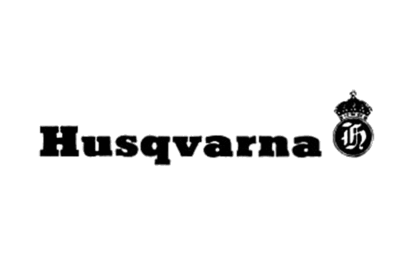
Before Husqvarna was synonymous with motorcycles, it was a firearms factory founded in the 1600s in Sweden. The first logo for Husqvarna motorcycles was conceived in 1912, featuring monochrome lettering beside a rounded emblem containing a Gothic monogram and crown. This was much different from the musket markings but carried its own form of elegance.
Modern Reinvention
In 1983, the logo underwent a significant change, adopting a stylized blue crown with the letter "H" inside it. Below the emblem, a title-case inscription was added. The modern version of the logo was born. This symbol was a tribute to the original brand used since the 1680s.


21st Century Update
In 2012, the logo was revised to adapt to modern sensibilities. The bright blue color was toned down to a darker shade, and the wordmark was updated to feature "Husqvarna Group" over two levels below the iconic crown. This gave the whole image a more expensive and professional look.

The Typeface and Palette
The modern Husqvarna logotype uses a clear and distinct sans-serif font, echoing fonts like Sequel Sans and Shapiro Max Heavy. Its blue and white color palette symbolizes protection, reliability, and high quality.


